Integrated brand identity system for one of the world’s leading research institutions.
About the Project
Hawkeye was tasked with the refinement of the Rice University Brand System, while also addressing inconsistent usage of brand elements across the organization despite having guidelines in place. As with much of higher education, the schools and departments that make up Rice University have the freedom to position and market themselves as needed for their specific audience. This model of self governance lead to inconsistency from school to school, with varying degrees of quality depending on the skillset of the team or individual doing the work.
Previous Rice University Shield & Owl Iterations


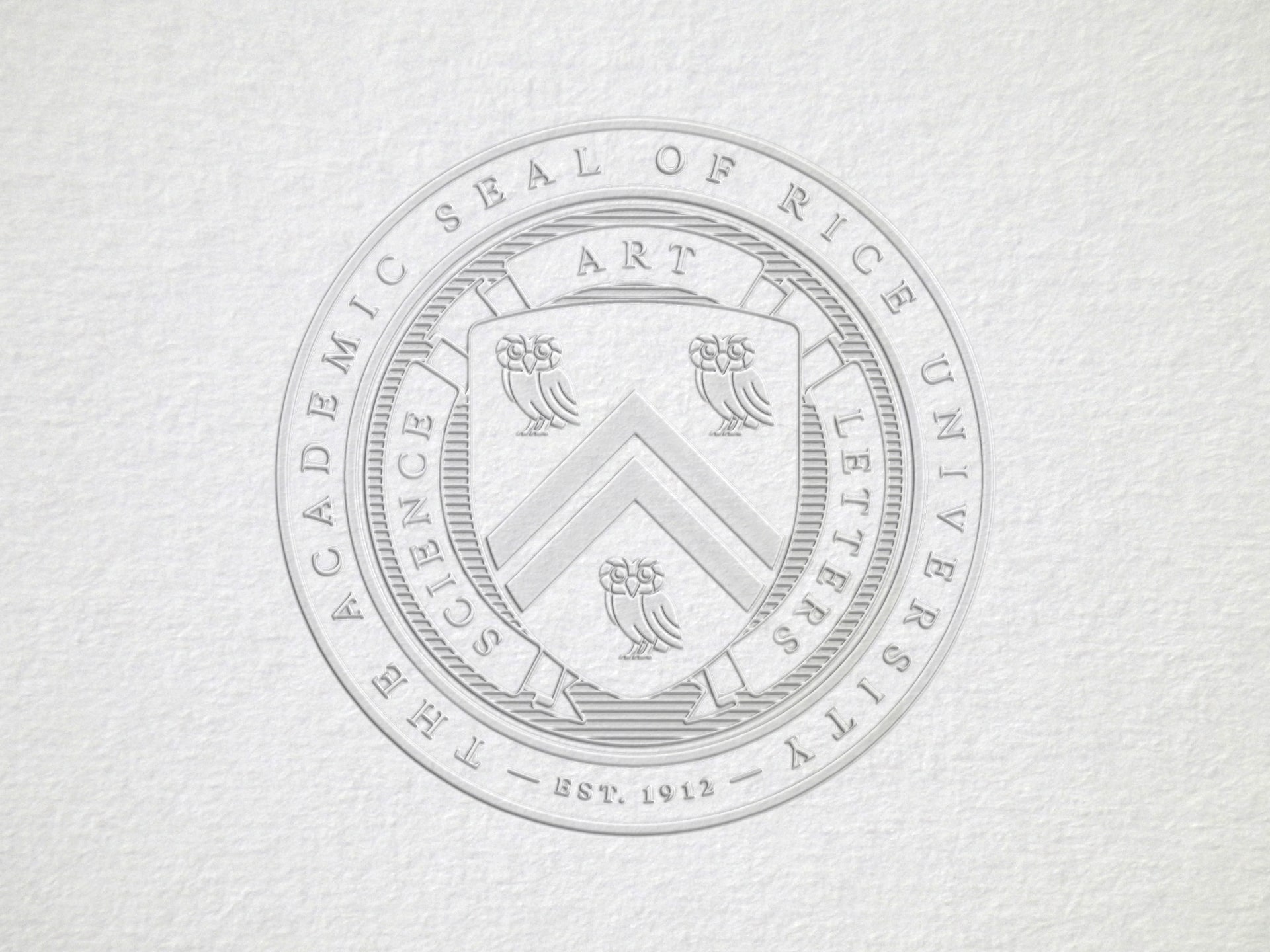
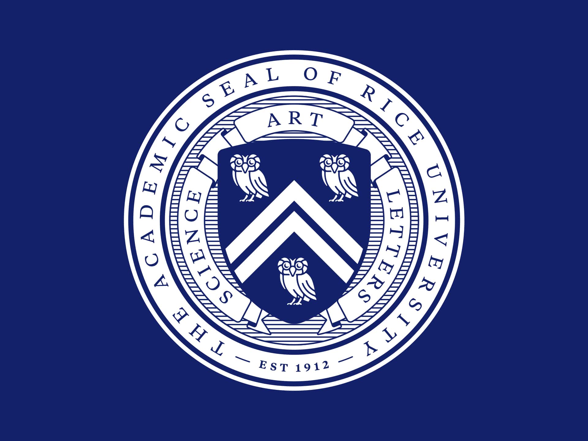
The design of the the Rice University Owl and Shield had experienced challenges over the years. The previous shield iteration was designed as rasterized photoshop art, making it unusable for certain applications. Due to this, multiple variations and interpretations of flat vector artwork had amassed.
Hawkeye designed the new owl to retain the most memorable aspects of the original design, specifically the eyes and feathers around them, the engaged pose and prominent wing. How the owl performed when extremely reduced was a focal point during the process, as the Rice University shield contains three owls and two chevrons.
While the owl and shield were primarily designed for use as flat vector artwork, the stakeholders involved wanted to retain a gradient version reminiscent of the rasterized shield. For this purpose a gradient mesh of the shield was created for limited use.
The positive and negative space relationship was crucial to the performance of the owl. The negative space, or white inside of the icon, had to function successfully when outlined and on its own in the shield. This allowed for interesting ways of making the “negative space” a positive element, as seen with the embroidery of a baseball cap.
A system of web ‘toolkits’ were designed and developed to provide digital and web assets that can be tailored to the individual needs of the schools and departments, while providing a framework to increase the likelihood of maintaining a high level of quality across the organization as a whole.

The system takes a ‘building blocks’ approach, with assets that can be customized and rearranged, giving users a larger breadth of tools so they can focus on the quality of content. This also helped to reduce the primary financial burden typically associated with onboarding schools and departments into a new website – design, production, and development.


Conclusion
Rice University is an environment built around the freedom of individuals to pursue their passion without the burden of outside influence. In the corporate arena, branding is ruthlessly enforced. In academia, there is no such enforcement, only independence and organizational silos. Keeping that fact as a constant reference was critical to the success of the effort. Our belief is that if a system is thoughtful, beautiful, usable and useful, the likelihood of independent silos adopting that system increase substantially. Thus giving Rice University the greatest chance of success in establishing a common voice, while enabling users to tailor the verbal and visual language in a way that best suits their audience.

